|
|
 |
|
|
|
|
| Black Ti Theme Features |
| So you like Titanium 2 but it's not classy enough? Black Ti will solve that problem. Featuring our beautiful brushed metal, but in a deep charcoal tone. The same 19 photo cutout designs from Titanium 2 are included along with darker chart fills and black pearl bullets. Extras include oversized white and black pearls, a bow tie and Moon photo objects, one complimentary master slide (inverse), three screw heads, two metal "lines" that can be used as a break or underline and a number of opaque and translucent PowerFills including three that fade to transparent. These are great to construct additional design elements to add that touch of class (see movie). Important if you are going Black Ti. |
| |
 |
(2.2 MB) |
| |
| Photo Cutouts |
 |
| |
| Extras |
 |
| |
|
|
|
|
Da Vinci Theme Features Updated (Note: Forward your 2012 receipt for a free upgade)
|
|
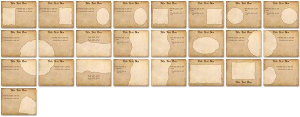
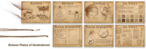
Updated to Keynote 5, making use of custom Image Placeholders. Now you can just drop images into the photo masking element, move, resize, even edit the shape to anything you need and still have a torn edge. Your ideas are simply genius! Now present them as one of history's brightest would. Built on Leonardo's famous sketchbooks, Da Vinci includes three fonts, one for titles, one for regular content and one "from the hand of" da Vinci. Bring this Master's look to your audience with sketched chart fills, some focus elements, hand drawn lines and a Photoshop® Action Script to turn images into sepia illustrations. The coolest feature in the Extras.key file is 61 original da Vinci illustrations made transparent so they float on the background. They can be resized and positioned anywhere you want and opacity reduced so they fade nicely into the paper and are less emphasized.
This is truly a concept theme, which can take any content and bring originality and interest to it.
|
| |
 |
(4 MB) |
| |
| Photo Cutouts |
 |
| |
| Extras |
 |
 |
| |
| If you have access to Photoshop®, this will allow you to prep your visual content for the theme. We have developed an Action Script that will turn any photographic content into sepia ink illustrations. Look in the Extras file for Instructions. |
 |
|
|
|
|
|
| The Plan Theme Features |
|
The background texture is a heavy stock, rough paper with die cut photo cutouts. The Plan includes 42 photo masters, (many connecting), eight text and one complimentary. Because the background is an even texture the user can duplicate a photo master, unlock and reposition the cutout and then use the included "PowerFill" shape to cover up the resulting gaps. Includes two themes, one with grayscale charts and another with color charts. The complimentary slide uses a darker shade of the background texture with chart text darkened for legability. Charts and tables are sized and positioned appropriately for each master slide.
|
| |
 |
|
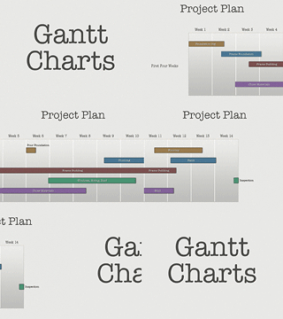
The Extras include templates to easily construct Gantt charts, they come in grayscale or color to match both themes, in one and two project layouts with two to six time-period columns. The cool thing is you can connect several slides of charts and seamlessly move through weeks and weeks of your project plan using slow push transitions. These chart templates can be pasted into any theme and it's backround. Note: We have not added a new type of chart into Keynote's menu selection. |
|
| |
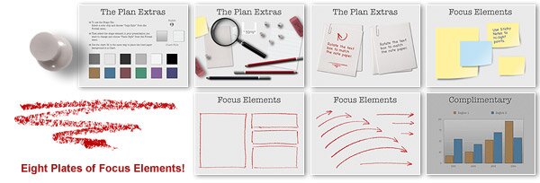
| Also included are a bunch of planning-type Focus Elements such as yellow and blue sticky notes, paper clipped pages and 8 plates of hand drawn red hi-light marks. Plus red hi-light pencil, magnifying glass, tacks and erasure. |
| |
 |
(3.8 MB) |
| |
| Photo Cutouts |
|
|
| |
| Extras |
 |
| |
|
|
 |
|