|
|
 |
|
|
| KeyFX (only available with the purchase of Set 7, above) is something new in the Keynote world. Initial work by Ken Drake led the way in making custom Keynote Shapes, (editable fill and line) and in this case, with a hole in it. This is useful as a Photo Master that users can easily edit. A brilliant idea! Theme Park built on Ken's initial work and the result is KeyFX, a way for the user to make their own theme with their own background colors or image, and still retain the photo cutouts. Find out more about KeyFX at the end of this page. The following three themes are made with KeyFX. These are 1024 x 768 Keynote themes but with an underlying resolution of 1500 x 1126 so they scale up well to fit display, even big displays. |
| l |
 |
|
|
|
| KeyFX Fusion Theme Features |
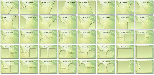
| Fusion is made from KeyFX Light and uses a background from featured designer, Alex Puentes. This theme includes the 34 standard KeyFX Photo Cutouts plus six more designed specifically for Fusion. Extras include an accent image, translucent info panels with adjustable tab and bar title areas in theme colors and some alphanumerical labels and navigation buttons. |
| |
| Photo Cutouts |
 |
| |
| Extras |
 |
| |
|
|
|
 |
| KeyFX Sine Theme Features |
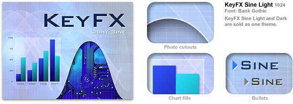
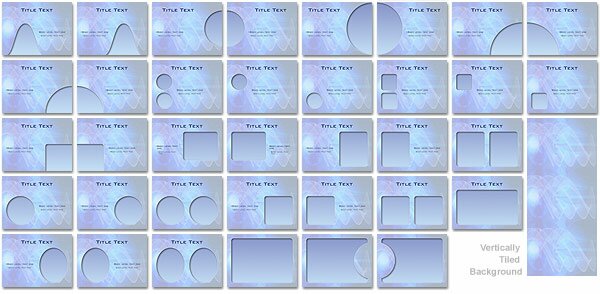
| Made from both KeyFX Dark and Light, Sine comes in a light and dark version using a background designed by Alwyn Cooper. The unique thing about Sine is that the grid (both the background and the one overlaying the Photo Cutouts) are done in vector. This means that no matter how large you scale up for presentations things remain sharp. This theme comes with the standard 34 KeyFX cutout designs plus two custom done just for Sine. Extras include an accent image that works well with both the light and dark versions, plus info panels, labels and navigation buttons customized for both versions of the theme. The background is tiled vertically so you can use a slow Push transition and have it seamlessly slide up or down for an impressive look. |
| |
| Photo Cutouts |
 |
| |
| Extras |
 |
| |
|
|
|
| KeyFX Slate Theme Features |
|
Slate is made by doubling up the background shape to get a hi-light and a shadow, giving the look of a recessed photo cutout. This background is tiled horizontally so you can use the "Push" transition to slide the background along seamlessly. It comes with the standard 34 KeyFX Photo Masters, and the usual info panels, labels and interactive buttons.
|
| |
| Photo Cutouts |
|
|
| |
| Extras |
| |
|
| More about KeyFX |
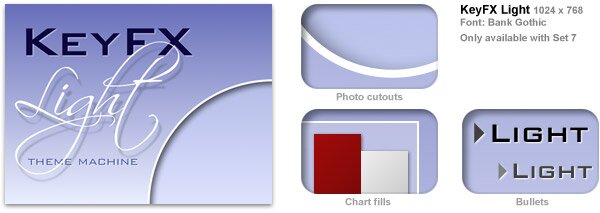
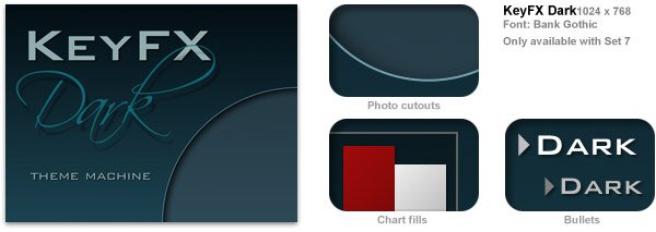
| KeyFX is made up of two base themes, from which you can make your own, one for light backgrounds and one for dark backgrounds. These default themes have light blue and dark green backgrounds and are fine to use as is, edit the color or insert a background image of your choosing. The Extras supplemental file has instructions on how to do this. Elements such as tables have been set to neutral grey shades so themes can be used with a simple background change. You can see in the samples above how a background change and a few other tweaks can give you the power you have always wanted from Keynote. Both KeyFX Theme Machines come with 34 photo cutouts, a basic set of info panels, labels and interactive navigation buttons. All editable to your color scheme. |
 |
| |
 |
|
|
| |
|
|
 |