|
|
|
 |
 |
|
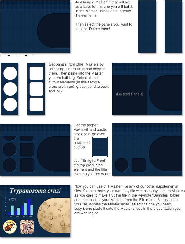
286 Photo Cutout Masters! That's over 300 when combined with those that are included with the Basic Research theme. Charts and tables have been sized to speed your development time. Not only that but the user can easily customize and build their own. Take a look at how easy it is to make exactly the Photo Master you need. Make one, ten or a thousand unique Masters! |
|
| . | |
 |
|
|
Almost all the Masters are built with panels based on quarter, half and three quarter wide panels. Simply mix and match combinations of panels to make just about any Photo Master you can imagine. Word of caution though, for the grid pattern to remain in alignment you must keep the position of the panels in the same location. In the example above two panels on the right side are deleted, they must be replaced by panels from another Master from the exact same location. It's very helpful that the copy and paste action retains the location so you should never need to move these elements around. One more thing, the graduated grid text panel and the graduated title panel are individual graphic elemets that can be deleted or added at will. What do the default Masters look like? Scroll down, way down. |
|
| . | |
| Bonus Cutouts of the Regular Type | |
| . | |
| Circle Cutouts | |
 |
|
| . | |
|
Square Cutouts |
|
 |
|
| . | |
| Landscape Cutouts | |
 |
|
| . | |
| Portrait Cutouts | |
 |
|
| . | |
| Triangle Cutouts | |
 |
|
|
.
|
|
| 35mm Slide Landscape | |
 |
|
| . | |
| 35mm Slide Portrait | |
 |
|
| . | |
| 35mm Slide Landscape (Skewed) | |
 |
|
| . | |
| 35mm Slide Portrait (Skewed) | |
 |
|
| . | |
|
|
|