|
|
 |
|
|
| TecTile Keynote 3 Theme |
|
|
|
| TecTile Theme Features |
|
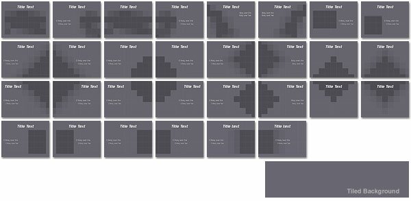
Until TecTile arrived, Keynote's "Mosaic Small" transition was just a bit of eye candy, now it has real purpose of design (see movie). The theme background is made up of individual tiles, each tile can be deleted or have it's opacity adjusted by the user to allow images to show through. Each tile is sized and positioned to match the flipping tiles of the mosaic transition, (can't wait for a "venetian blind" transition). Image edges can softly fade in or have a hard definite edge. There are a total of 30 default photo cutouts with many bleeding off the slide, ready to connect to the next for those stunning transitions. Two contemporary fonts are included with this theme including a family of regular, bold, and italics for the body text. Charts have a light to dark translucent grid background with an option to replace it with the reverse (dark to light). Twelve plates of chrome Focus Elements add a nifty touch. Use them in a clean modern way or in a retro, 50's sort-of-way. They are great to use with other themes too, such as Titanium. You also get a good selection of translucent and opaque fills to add a bit of visual texture.
|
| |
 |
(3 MB) |
| |
| Photo Cutouts |
 |
| Extras |
 |
| Interactive Navigation |
| Simple interactive multimedia projects can now be done using Keynote 2's hyperlink tool. We have made a set of buttons that include Next, Back, Jump Forward and Back in active and non-active (ghosted) states that match the theme. Plus a menu item button that should come in handy! Check out the sample interaction in the Extras file. |
 |
| |
|
|
|
|
| Reflections Theme Features |
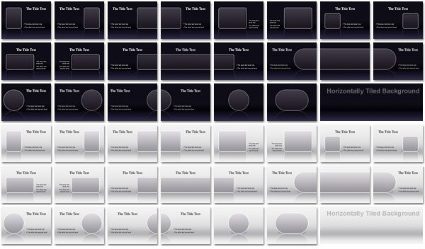
| This is a Keynote 2 theme. This unique theme gives the appearance of content reflecting on a highly polished surface, just like the upcoming iChat AV window! Reflections includes 22 Photo Cutout Masters (plus 8 text) that come in both black and white for a total of 60 masters. But there really is no limit, all cutout widths are totally adjustable. Just slide the sides anywhere you want. You can even apply the "separator" elements and you can have multiple cutouts. Also included are a series of labels and focus panels (with useful title tab or bar) for both light and dark themes. Interactive navigation buttons for use with Keynote 2's hyperlink tool are featured. Including Back, Next, Jump Back and Forward, Home and a smaller Menu Item button in both active and non-active states. |
|
Be sure to have a good look at the 60+ slide Extras presentation that includes examples and instructions.
|
| l |
 |
(6 MB) |
| |
| Photo Cutouts |
 |
| |
| Extras |
 |
|
|
|
|
|
|
 |
(4 MB) |
| |
| Global Cool Theme Features |
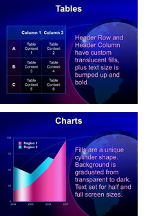
| Global Cool includes four themes, one has an animated globe turning 360, the others show the Americas, Asia and Europe statically. They all come with 12 unique Photo Master slides and their matching opposites plus 10 Text Masters and a complimentary one for a total of 35 Master Slides. Masters are constructed in layers so you have the ability to adjust the opacity of the continents or the "aqua" overlay. Another option is to remove them completely and make a clean, cool blue theme. Tables include a transparent to dark background with translucent blue and purple Row and Column Header fills with larger bold text settings. |
|
|
 |
Row and Column Header settings are the type of things you do not get when a theme is compatible with Keynote 1.
Chart fills are a unique cylinder shape with a graduated transparent to dark backgound. Depending on the Master Slide, charts are added as half or full size and text label sizes are adjusted accordingly.
Global Cool comes with some great Extras, the standard color chips, Info Panels (using the imbedded text feature), two sets of Aqua Labels and Navigation Buttons but also a series Global Graphics and Overlay Elements. These can be used individually or several together in varying degrees of opacity to construct striking layouts. We have already heard from one user who says they are "fantastic"!
In addition, two animated globe movies are included, one has suspended continents on an invisible sphere and one is adapted from NASA's "Blue Marble" Project. All the detail of clouds and land masses, plus it's an object without background so it can be used anywhere!
|
|
|
There are also unique overlay elements you can use to add some visual interest, Crosshair, Rings, Ticks and Grid come in black, white, blue and purple and can have their opacity adjusted for different situations.
|
| |
| Photo Cutouts |
 |
| Extras |
 |
| |
 |
 |
|