|
|
|
Going Beyond "Professional"
|
I have used terms such as “professional” and “high-quality” to describe my products in the past, but those terms are thrown around by every theme maker and have become meaningless marketing jargon. Of course, I don't make the only themes worth purchasing, there are some truly great ones out there. I would just like to state a few things about the process I use to design themes, a few features that came from that process and avoid telling you these are "professional-grade" or any other such term, since that doesn't mean much. |
| |
| Item 1 Think about what Keynote can do |
| Nice background, nice bullets, nice fills for charts, is that a nice theme? Could be. But I want to go beyond that. Many of the background images are tiled horizontally so you can exploit the push transition seamlessly. Photo cutout edges are done in individual grains of sand in Desert or a soft pool of light in Spotlight to leverage Keynote's support of transparency. Another example are the da Vinci illustrations, isolated from the background (transparent) so opacity can be adjusted and/or moved independently of the background. TechTile's background is based on individual tiles of which color and opacity can be edited. Using the Mosaic transition you will see each tile flip over. The sides of photo cutouts in Reflections can dynamically widen or narrow on the fly. There are so many things to mention, but there is one idea behind them all. Understanding what Keynote can do and applying that knowledge to theme making. Now THAT makes great themes. |
| |
| Item 2 The Cube Trick |
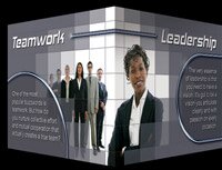
| This one deserves special mention because it's so cool and it is a Theme Park original. Early on I realized if the photo cutout bleeds off slide and you use half of an image on one slide and the other half on another... then, using a Cube transition, you can wrap an image around the cube corner. Or using the same idea, get a nice effect pushing the slide laterally. We include and promote this seamless effect in all our themes. |
 |
|
| |
| Item 3 The Cutout Trick |
 |
Another idea was having pixels within the photo cutout change or manipulate the image you place behind.
Ice Cold includes a snow overlay, Ocean has shadings of a droplet, Spotlight makes it appear your image is a pool of light on the wall and Tectile's tiles have differing opacity. A related feature is the da Vinci Photoshop Action Script that converts photographs into sepia ink drawings. A much better match when using the da Vinci theme.
|
|
| |
| Item 4 Extra Flexibility with KeyFX |
|
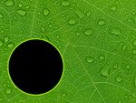
Based on a tip from Ken Drake on how to make a Keynote shape with a hole in it, I developed several themes called KeyFX. The compelling thing is you can have a photo cutout background and still edit the background image or color. Notice how great Keynote 4 is when resizing images with it's fancy border? Have you noticed you are stuck with only rectangles? Bummer. I like circles, and swooping curves too.
|
 |
|
| |
| Item 5 If you want plain, we got plain! |
 |
I spend a bit of time doing up nice layouts and cool movie demos using elements from the Extras and sample content to show what can be done. I try to show as much as possible in a single slide or short demo movie, not what I think every slide in your presentation should look like, indeed, some single slide examples are likely too much in many real world presentation situations. The only reason this needs to be addressed is that our marketing efforts have got the attention of a few fellow theme makers. Describing their own themes as, "without being gaudy or distracting" another site said theirs, "drops all the fluffiness and over the top graphics". I guess it needs to be pointed out, gaudy and fluff is in the hands of the user and in the eye of the beholder. The actual themes are innocent of being gaudy or over the top. Any of my themes can be used in a simple and plain manner as seen on the left. Not very distracting are they?
|
|
| |
| Item 6 Speaking of Fluffy Extras |
Each theme comes with a .key presentation file that includes tips, instructions and supplemental graphic elements that can add a great deal to the theme. The amount of Extras vary between a few slides for a straightforward theme like Granite to over 50 slides for Spotlight HD.
|
 |
|
|
|
|
What People Say
"Impressive to say the least, and represents the creativity that reminds me of why I own Macs and why I use Keynote."You knock the socks off of anything I've seen out there!
Dr. William J. Palank
I love Spotlight. It rocks! So many times people come to me after my presentation and ask where I got the theme! It is just too awesome!!!!
Gary C. Horton

|
|
| |
|
|
|
|
