|
|
|
 |
 |
|
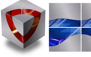
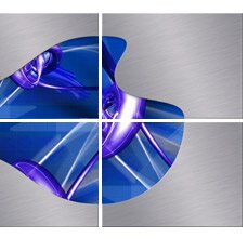
These 30 extra Titanium Photo Cutout Masters make the original Titanium theme the ultimate for use with the "Cube" transition! You might feel you don't have any images to dress up your content, in that case, use a secondary background of your choice. Take one image, possibly blow it up, blur it, darken or lighten it. Leave it as an accent or use it as a second area to place content. It's a great way to achieve a "look" for your presentation (see the "Growth" slide below). These Masters are designed in a modular way, the cutout backgrounds are sliced into one quarter, one half or three quarter sized columns, and once the Master is onlocked and ungrouped, you can easily mix and match columns and make your own unique Masters. Like this... |
|
|
. |
|
 |
|
| . | |
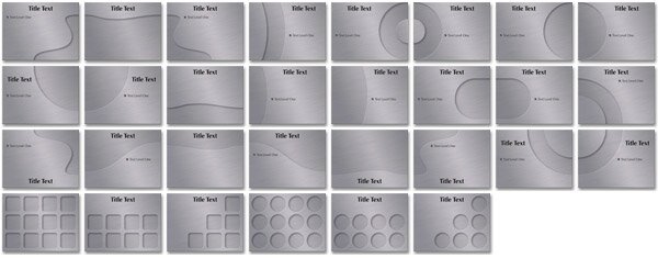
| The original theme included two "Quarter Round" corners and one "Quarter Round Band", now you will have all four corners complete, the two opposite "Swoop" cutouts, plus connectors and many more. A more detailed discription about how to customize Masters is included with the Basic Reaserch description. The Titanium 2 Theme includes a cover "Powerfill" so you can cover cutouts (some in the last row in the samples below have been covered) As always, charts and tables have been sized to speed your development time. | |
| . | |
| Additional Cutouts | |
 |
|
| . | |
|
If you are looking for a cool background graphic to use as an area of contrast for the brushed metal, you can find them for a buck or two at istockphoto.com Try a search on "3D Rendering" and you will find gems like these!
|
|
|
.
|
|

|
|
|
|
|