|
|
 |
|
|
|
|
TransInfinite Theme Features
|
|
This theme is based on high quality marketing packages that use complimentary fine papers, full color print and die cut embossed card stock. This is the first theme specifically designed for exclusive use with Keynote's Push and Cube transitions. Twelve of the nineteen photo cutouts are made so they align and bleed into the next. Not only that, both the theme and cutout backgrounds are tiles, so you get perfectly seamless transitions. But the most original, groundbreaking feature is what we call "PowerFills". They allow the user to quickly and easily make beautiful additions to the actual design of the theme. It is a simple idea with powerful results (see movie and PowerFill Extras below). The embossed soft cream color will look great with any content matter, as well as the three custom bullets that appear punched out and custom chart fills. All charts and tables have been sized and positioned for each Master Slide. Extras include two complementary backgrounds and five tiled PowerFills. If you own Keynote, this is a must have theme!
|
| A |
 |
(3.6 MB) |
| A |
| Photo Cutouts |
 |
|
.
|
| "PowerFill" Extras |
 |
|
.
|
|
Important Note: When making PowerFill elements it is sometimes appropriate (depending on the situation) to change the shadow to highlight (or vise versa) or the angle to create an optimal embossed or die cut look. Experiment a bit!
|
|
.
|
|
|
|
| Museum Theme Features |
| The original "Museum" was a theme only Liberace would love. In our quest to produce top quality themes we have tossed out the gold leaf frames in favor of weathered driftwood with matting and toned down the paint elements. Eleven of the sixteen photo cutout Master Slides bleed to produce those spectacular Push and Cube transitions. Charts and Tables have translucent backgrounds and are sized per master. Charts are customized for the complimentary background. Extras include an artist's brush, the usual chart fills and translucent chart background fills, an overlay to add sepia tone to black and white photos, plus paint dollops and blobs in subdued and bright versions. Unique to Museum is four corner frame objects that can be mixed, matched, moved and rotated to give incredible layout variety! (see below) |
| A |
 |
(4 MB) |
| A |
| Photo Cutouts |
|
|
|
.
|
| Extras |
|
|
|
.
|
| Important Note: When using the Frame Objects take note of the shadow and choose the correct one when making your own layouts. Light source is upper left. |
| |
|
|
|
| Basic Research Theme Features |
|
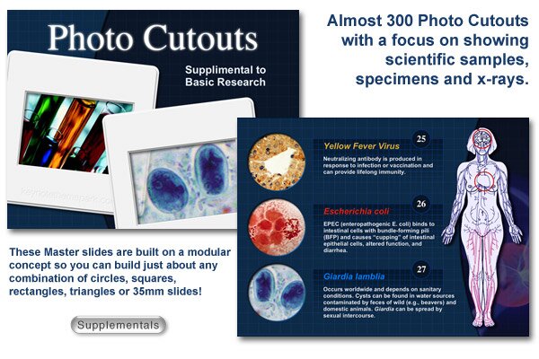
This theme is the foundation for a series of upcoming supplemental products specifically designed for the medical, health, dental, science and architectural fields. That said, it is a simple grid pattern and would suit many applications. The most compelling feature of this theme is the ability to customize it with the supplemental Photo Cutout Masters (see below). Many of the Masters are made from a series of quarter screen panels that the user can assemble in any combination to create unlimited variability. These supplemental files have nearly 300 Master Slides featuring circles, squares, triangles and 35mm slide frames. In addition, you can invisibly cover any photo cutout with the appropriate "PowerFill" and you have the ability to make hundreds of additional layouts.
Another of the PowerFills is graduated and made for slipping behind text blocks or charts to really help bring professional design into the user's hands. Charts and tables are sized correctly for each master. The theme comes with 16 basic photo cutouts with many that align with the next for that spectacular effect with the Cube and Push transitions. Tiled left and right edges give seamless Push transitions. Clean chart colors all in the blue spectrum, a simple bullet design, theme palette and one complimentary background are included.
|
| A |
 |
(2.5 MB) |
| A |
| Photo Cutouts |
 |
|
.
|
| Extras |
 |
| A |
|
| Suppemental to Research |
 |
| |
|
|
 |
|