|
|
 |
|
|
| Bevel Keynote 3 Theme |
|
|
|
|

|
| Bevel Theme Features |
|
If you have not yet upgraded to Keynote 3, Bevel is a very good reason to. Now, with the ability to Mask images to a Shape, there are stunning possibilities. Take a look at the demo movie to see some of the effects easily created with this theme. Being a KeyFX theme means you have total control over background color and image.
|
|
| You are not locked in to what we decide, but as a start, we went with a black background and grey content panels edged with soft hi-light and shadows that will emboss anything sent to Back. We borrowed the chart fills from Global Cool because... they are just so cool. Being a true Keynote 3 theme means there are unique fills for 3D charts. Object Placeholder has been sized and placed within one content panel for each Master and the size of Chart labels vary in size depending on how large or small the chart is rendered. It's all in the details. |
| |
|
The theme comes with a basic set of 48 Master Slides with an additional 121 in a supplemental file that includes a unique interactive selection guide. Just hit "Play"... then click on any one of the 121 layout designs. Boom, you are taken to that slide, then just hit escape and copy, ready for pasting into your presentation. There's no scrolling through 100 plus slides.
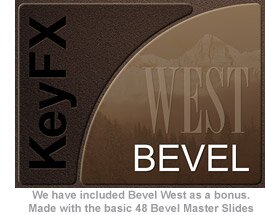
We have created Bevel West a bonus theme made with Bevel's 48 basic Master slides to get you started on the many themes you will be able to create.
|
|
|
|
i
|
 |
Photo Cutouts
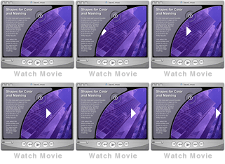
| This image is a preview of the interactive selection guide that has been incorporated to ease the selection of slides from such a large list. |
| |
|
|
|
| Extras |
| The Extras include instructions on how to flip the background frame shapes (don't just use the "Flip" menu item) so that you can make the opposite layout to what is supplied and generally, how to make a theme with Bevel. Included are custom shapes that follow the odd shaped panels so images and color can be masked to them. Sample background images to expand the Bevel West theme and another set to make a brand new theme are ready to go! Also included are round and rectangle bevel Focus Elements, extra bullet colors plus a few nifty slides we put together so you can take them apart and see how they work. Speaking of Focus Elements, there are bunch of beveled panels in the Super Elements package. You might consider grabbing those if you don't have them yet. |
 |
|
| |
| Panel Keynote 3 Theme |
|
|
|
|

|
| Panel Theme Features |
|
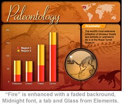
Based on the same cutout designs as Bevel, Panel consists of a basic blue theme of 48 Masters plus 121 additional layouts which use an interactive guide that eases the selection process (first seen in Bevel). Designed with your custom work in mind, one way to make quick work of a custom theme is to set to Back a reduced opacity image on the Slides! The "Panel" image above and the"Paleontology" image below are examples.
|
|
| |
 |
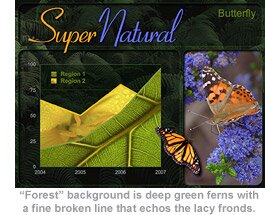
Along with the base theme, Panel comes with two bonus themes. Forest is created with the more advanced method of theme making, using image fills. Background is deep green ferns from a carpeted forest floor. Panels are defined with a thin broken line that echos the delicate lace of the fronds. Incudes very unusual flora chart fills, unique bullets, and our "Midnight" font. |
|
|
| |
 |
Fire is done with just a basic color change from Panel's blue tones to an orange and red combination. Here, we have dressed it up a bit, the background image (with opacity reduced) has been sent to Back, this image and the tab elements are from the included Extras file. Also used is the Midnight font, one of the World outlines from Global Cool, and a dinosaur outline from iStockphoto.com. The red aqua bead to indicate location and the "Glass" overlay image are from our Super Elements. It all comes together pretty well! With a little effort Panel can take on any character you wish.
|
|
| i |
 |
Photo Cutouts
| This image is a preview of the interactive selection guide that has been incorporated to ease the selection of slides from such a large list. |
| |
|
|
|
| Extras |
| The Extras that come with Panel include much of what comes with Bevel. One of the cool tricks with this theme is to embed extra panels into the frame design and build them in and out. The results are seen in the demo movie, instructions are included in the Extras. |
 |
|
| |
| Spotlight Keynote 3 Theme |
|
|
|
|

|
| Spotlight Theme Features |
|
Roll out the carpet and turn on the lights! Enlighten your points and your audience with "Spotlight". Use builds and transitions to turn any of the five styles of spotlights on and off. Focus a beam of light directly on what is important! There is a certain ambiance to this theme that makes it feel you really are in for a great "show". Two Sounds are included, the breaker "thud" that echos across the stage.
|
|
|
| |
 |
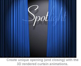
Another is a light clapping. We can all use a bit of applause once in awhile, even if we have to manufacture it ourselves. Spotlight comes with expertly rendered 3D opening and closing curtains. Build a bit of anticipation as to what is to come by bringing opacity down and give the look of shear curtains (as seen in the movie). Or use them to transition between significant sections of a presentation, behind curtain number one... two etc.
The two movies can be used with any 4:3 theme in your collection.
|
|
| |
|
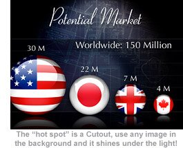
Spotlight includes three background textures, Brick, corrugated Metal and weathered Barn that have seamlessly been tiled on the horizontal edges affording the use of invisible Push transitions. Cutouts are multi-purpose in that they can remain empty, be used for pertinent images or symbolic backgrounds.
Please note, only the Chinese nation "orb" is included with the Spotlight Extras. Others seen here are not included with the theme, along with national border Keynote shapes the, orbs will be released as a Super Elements package.
|
|
|
|
|
| Photo Cutouts |
| The theme contains 45 "hot spot" cutout masters that look great empty or with an image. A good number are designed to connect with its opposite for great Push transitions that make it appear the spotlight is panning across the stage. Another great looking transition to use is Fade Through Color (black) which gives the impression spotlights are faded down and then up again. |
| |
| Extras |
| The Extras consist of 36 slides of samples and instructions on how to get the most out of Spotlight. Such as how to make an independent shadow of the included mic or any object, within Keynote. If you like something, just take a look at the build programing to see how it's done. You can always copy and paste a slide into your presentation and adapt from there. |
| |
 |
|
|
 |
| |
|


